The Impact of Good Web Design Techniques
There’s more to a website’s success than content. Its web design has to be compelling and provide users with the best experience.
Its functionality has to be user-friendly above all else. While different people prefer different styles, you have to follow universal rules when deciding how to present your website.
Keep Your Homepage Free of Clutter
Users rarely read every word that you have on your website, especially if it’s on the homepage. They usually scan the pages of your website, looking for certain keywords. With this in mind, it’s best that you appeal to their eyes than your ideal word count. Potential clients shouldn’t have much to read or click on. They should have less to look at so that they can process what your website is about. Of course, call to action and some text is necessary, but you want to be thoughtful about it.
Design With Visual Hierarchy in Mind
When designing a website it should be set up in a clear manner. When a web user clicks on your site, they form their first impression within seconds. It’s your job to make sure that impression is a good one and that they don’t click away. You want it to pull potential clients in and present exactly what your brand is about.
When you establish a hierarchy for how you want to present the information on your site, you’re able to clearly present what you want. From there, you can apply contrast, color, spacing, and size to really draw in attention.
Create Easy to Read Website Content
You want your site to be easy to read so that users can efficiently scan your website and take in what it says with little effort. To achieve maximum readability, you want to follow three simple steps.
The first step is to ensure that your text and the background of your website contrast. This means that the colors you’ve selected don’t clash with each other. While you may enjoy different shades of yellow, it would be very hard to read if you combined these colors on your website.
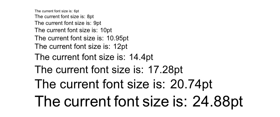
The second step is to make your font big enough. In the early days of the internet, font sizes were small. These font sizes get even smaller as the size of monitors gets even bigger. The size of the font used to be 12pt, but 16pt is a good standard for the web. It all, of course, depends on which font you choose.
The third step is choosing the right font. While font that looks like cursive and handwriting seem cool, they’re harsh on the eyes of your online visitors. The best fonts for your website come from the Serif font family. Times New Roman is the most well-known and used font from the Serif family. Sans Serif fonts can also work for your website.
Ensure Your Site Is Easy to Navigate
You may be tempted to break the mold in terms of your web design. Doing this can be good in some aspects, but not when you’re dealing with navigation. A site that has solid navigation will be ranked better in search engine results. More importantly, you don’t want to send potential clients on a wild goose chase while they’re trying to find out what you offer.
A few methods to ensure that your web design is easy to navigate include a few tricks. First, you want to ensure your homepage is linked to your logo. Your menu should be located at the top of your website. If your website is one that you have to scroll through then have navigation somewhere on the side. Lastly, you want to ensure that you have a strong footer that has other important links.
The Bottom Line
Web design is essential in making sure that your brand succeeds. While it’s easy to run away with your creativity, you want to make the best choices for your website. Above everything else, your website should attract new customers and entice them to try out your product or service.
5 Quick Tips to Improve Your Web Design
The great thing about web design is that you have complete control over how you want your online site to look. Having a great web design when creating your site can increase productivity and the traffic going to your site. Clients want something that’s easy to navigate and looks good.
Here are a few quick tips to improve your web design so that you can take your website design to the next level.
#1 Sidebars
While you may use sidebars to enhance the usability of your site, you may be creating clutter instead. Sidebars are usually used to create quick links to recent posts or popular content on your site. While this should technically enhance the user experience, very rarely do visitors use them.
We are not saying you need to get rid of sidebars completely. Instead, you can try phasing them out by making your content and other important elements the focal point of your page. You can do this by using designs and colors that stand out.
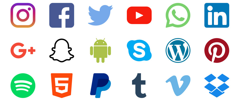
#2 Social Media Icons
So, your viewers have finally landed on your website! If you have your social media icons on the top of the page you are inviting them to leave your site. Instead, try to list these icons in the footer of your page so that consumers can browse your site, make a purchase, and then if they wish they can be redirected to your social media account.
Additionally, you should be using your social media accounts to drive more traffic to your actual website – not the other way around. Advertise your business as much as you’d like on social networks, however, once the viewer lands on your page, you want to keep them there long enough to make a sale!
#3 Navigation
Simplify your navigation to provide a user-friendly experience for everyone. When it comes down to web design, sometimes less is more! Reducing visitor options can help guide viewers to the important content on your site. Also, they may feel overwhelmed when being offered to many options.
To simplify your navigation options eliminate drop-down menus and reduce the number of links you have in your sidebar and header.
#4 Play with Font Size
The typography you use on your site is such an important part of web design. You want to make important headings or phrases stand out by increasing the font size and bolding text if necessary. Consider increasing your normal font size as well to increase visibility.
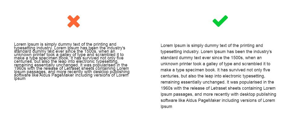
#5 Use White Space
Don’t try to cram everything into a small space. You want your web design to be able to “breathe”. To give your site a clean layout, consequently, your viewers increased usability, use whitespace whenever necessary. You don’t need the color top to bottom. Instead, give your site a cleaner layout by adding some blank areas.
Following these five quick tips can make a significant difference in your web design. It will give your viewer an easier to navigate site increasing user experience. Additionally, having a cleaner web design will give your site a more professional look encouraging your visitors to make a purchase.
If you still have questions, the team at m2 is ready to help. Feel free to contact us and we can assist you with improving your website design.
Top reasons to build a WordPress website
WordPress intends to make the process of website design & building simple and hassle-free.
Now, you don’t have to spend hours finding the HTML code that is required for creating a website design. Instead, you can use various tools available in WordPress to make the process of website creation and management an easy one. There are many benefits of using a WordPress website, out of which some key ones are listed below-
-
- WordPress is Free- WordPress does not charge you anything and there are no hidden fees also. You can design your website for free as per your needs and specifications. So, save the money that you would otherwise have to pay to the designer.
- Ease of Use and Accessibility- In WordPress, you can make changes or edit the content on your own. It is very easy and simple to use. You will have a website design, which you can easily maintain on your own without any expert. Furthermore, to access WordPress, all you need is a computer with an Internet connection.
- Works for Blog and a Website Both- Initially, WordPress was used only for blogging but with time it has grown into a full-fledged web content management system. So it is best to use both for your blog and website.
- Abundant Themes- A lot of well-designed themes are available that you can use to enhance the visual appeal of your website. You can go through various options and choose the one that you like the most. You can go for an affordable pre-designed theme or get one custom designed for your business branding. Free WordPress themes are also available.
- SEO-friendly – Search engine optimization becomes very simple when WordPress is used. Using some plugins like All-in-One SEO Pack and SEO Ultimate plugins, you can easily get good search engine ranking.
- Flexibility of usage- WordPress is a complete CMS (Content Management System) that allows you to design a site with immense flexibility. It offers you loads of components like buttons, images, contact form, etc. that you can incorporate in your WordPress website design.
- Plugins for additional functionality- By adding a few plugins, you can add additional functionalities to your blog or a simple website design transforming it into a multi-level, full-service site. You can even develop a fully functional e-commerce system through WordPress by inserting a few plugins.
- Open Source- It is open-source and is not bound by any restrictions. This gives you the freedom to choose and host your website, anywhere you want, hence, giving you complete control over your website.
- Makes Website Mobile Ready- WordPress automatically gets to know where the person is viewing your site, on a mobile or any other device and displays the content accordingly.
- Popularity and a good support system- It is the most popular web platform, and almost over 27% of all websites are powered by WordPress. Moreover, if you are stuck anywhere while experimenting with its elements, you can easily get help and support because WordPress has a huge community of reliable users who are always ready to help each other.
We assure you that these are just a few of the many benefits of WordPress website design Brisbane and once you decide to use it, you will experience its other advantages as well. Contact m2media for a free quote or view our wordpress web design services
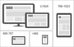
Top Tips For Responsive Web Design
Nowadays, almost every information is available on the fingertips, and this is also one of the reasons why people are always on their mobiles. It is hard to imagine life without mobiles these days. It is rarely that we use a desktop or laptop for surfing the Internet. Therefore, it has become very important for site owners to make their website design responsive. A responsive web design enables your website’s interface to adjust according to the mobile or tablet screen resolution thus enhancing its usability.
Here are a few tips for a good responsive website design.
1. Make it Mobile Friendly
As mentioned above, majority of the people use mobiles for internet surfing, so it is important to first build a mobile site and further progress to the desktop site. The text and logo should be easily readable on the mobile.

2. Understanding the Media Queries
There is a feature of CSS3 which enables the content to respond to different conditions on a device. Getting acquainted with Media Queries is important because these are the driving force behind a good responsive website.
3. Limiting the text on Mobiles
It is advised to use only the necessary and needed text on the mobile site and do not try to use everything same as on the desktop site. This will help the readers to know important information without getting lost in long texts.
4. Knowing the importance of Mobile
Do proper research and go by the statistics to figure out why someone is searching for your website on their phone. Research would tell you that different users have different needs. If you get to know that they need quick information on the go, then you should try on increasing the visibility of your search bar to facilitate the same.
5. Using Optimum Images
Make use of JPEG, GIF and PNG-8 file formats. Using PNG format is not recommended as it can increase the file size by almost 5-10 times which can slow down the loading time. It important to use the images with the recommended resolution and measurements which are generally 500*350 PX at 100 ppi.
6. Get Rid Of Unwanted Things
Eliminating unwanted elements is not only beneficial for the users but it also helps in increasing the performance of the website. Make sure to create a clean and chic looking responsive web design.
7. Using the Right Size Buttons
Avoid using small button sizes. For comfortable clicks, the buttons should be at least 44*44 PX. You can also use padding in place of margins as padding increase the area, which margins cannot do.
8. Get to know Google Design Standards
Here, Google recommends certain tips which can help you in loading the pages faster and thus designing a good responsive website.
If you pay attention to coding, using the right images, creating clean responsive web design and testing template components, then you can be sure of getting a super functional responsive web design, which loads fast and performs well.
m2media are the go to team for responsive web design Brisbane. Contact us today for your next web design project.