Nowadays, almost every information is available on the fingertips, and this is also one of the reasons why people are always on their mobiles. It is hard to imagine life without mobiles these days. It is rarely that we use a desktop or laptop for surfing the Internet. Therefore, it has become very important for site owners to make their website design responsive. A responsive web design enables your website’s interface to adjust according to the mobile or tablet screen resolution thus enhancing its usability.
Here are a few tips for a good responsive website design.
1. Make it Mobile Friendly
As mentioned above, majority of the people use mobiles for internet surfing, so it is important to first build a mobile site and further progress to the desktop site. The text and logo should be easily readable on the mobile.

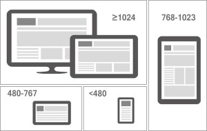
2. Understanding the Media Queries
There is a feature of CSS3 which enables the content to respond to different conditions on a device. Getting acquainted with Media Queries is important because these are the driving force behind a good responsive website.
3. Limiting the text on Mobiles
It is advised to use only the necessary and needed text on the mobile site and do not try to use everything same as on the desktop site. This will help the readers to know important information without getting lost in long texts.
4. Knowing the importance of Mobile
Do proper research and go by the statistics to figure out why someone is searching for your website on their phone. Research would tell you that different users have different needs. If you get to know that they need quick information on the go, then you should try on increasing the visibility of your search bar to facilitate the same.
5. Using Optimum Images
Make use of JPEG, GIF and PNG-8 file formats. Using PNG format is not recommended as it can increase the file size by almost 5-10 times which can slow down the loading time. It important to use the images with the recommended resolution and measurements which are generally 500*350 PX at 100 ppi.
6. Get Rid Of Unwanted Things
Eliminating unwanted elements is not only beneficial for the users but it also helps in increasing the performance of the website. Make sure to create a clean and chic looking responsive web design.
7. Using the Right Size Buttons
Avoid using small button sizes. For comfortable clicks, the buttons should be at least 44*44 PX. You can also use padding in place of margins as padding increase the area, which margins cannot do.
8. Get to know Google Design Standards
Here, Google recommends certain tips which can help you in loading the pages faster and thus designing a good responsive website.
If you pay attention to coding, using the right images, creating clean responsive web design and testing template components, then you can be sure of getting a super functional responsive web design, which loads fast and performs well.
