The Impact of Good Web Design Techniques
There’s more to a website’s success than content. Its web design has to be compelling and provide users with the best experience.
Its functionality has to be user-friendly above all else. While different people prefer different styles, you have to follow universal rules when deciding how to present your website.
Keep Your Homepage Free of Clutter
Users rarely read every word that you have on your website, especially if it’s on the homepage. They usually scan the pages of your website, looking for certain keywords. With this in mind, it’s best that you appeal to their eyes than your ideal word count. Potential clients shouldn’t have much to read or click on. They should have less to look at so that they can process what your website is about. Of course, call to action and some text is necessary, but you want to be thoughtful about it.
Design With Visual Hierarchy in Mind
When designing a website it should be set up in a clear manner. When a web user clicks on your site, they form their first impression within seconds. It’s your job to make sure that impression is a good one and that they don’t click away. You want it to pull potential clients in and present exactly what your brand is about.
When you establish a hierarchy for how you want to present the information on your site, you’re able to clearly present what you want. From there, you can apply contrast, color, spacing, and size to really draw in attention.
Create Easy to Read Website Content
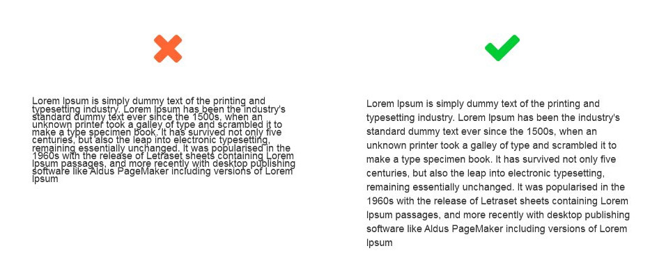
You want your site to be easy to read so that users can efficiently scan your website and take in what it says with little effort. To achieve maximum readability, you want to follow three simple steps.
The first step is to ensure that your text and the background of your website contrast. This means that the colors you’ve selected don’t clash with each other. While you may enjoy different shades of yellow, it would be very hard to read if you combined these colors on your website.
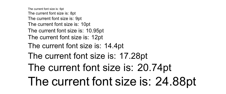
The second step is to make your font big enough. In the early days of the internet, font sizes were small. These font sizes get even smaller as the size of monitors gets even bigger. The size of the font used to be 12pt, but 16pt is a good standard for the web. It all, of course, depends on which font you choose.
The third step is choosing the right font. While font that looks like cursive and handwriting seem cool, they’re harsh on the eyes of your online visitors. The best fonts for your website come from the Serif font family. Times New Roman is the most well-known and used font from the Serif family. Sans Serif fonts can also work for your website.
Ensure Your Site Is Easy to Navigate
You may be tempted to break the mold in terms of your web design. Doing this can be good in some aspects, but not when you’re dealing with navigation. A site that has solid navigation will be ranked better in search engine results. More importantly, you don’t want to send potential clients on a wild goose chase while they’re trying to find out what you offer.
A few methods to ensure that your web design is easy to navigate include a few tricks. First, you want to ensure your homepage is linked to your logo. Your menu should be located at the top of your website. If your website is one that you have to scroll through then have navigation somewhere on the side. Lastly, you want to ensure that you have a strong footer that has other important links.
The Bottom Line
Web design is essential in making sure that your brand succeeds. While it’s easy to run away with your creativity, you want to make the best choices for your website. Above everything else, your website should attract new customers and entice them to try out your product or service.
5 Quick Tips to Improve Your Web Design
The great thing about web design is that you have complete control over how you want your online site to look. Having a great web design when creating your site can increase productivity and the traffic going to your site. Clients want something that’s easy to navigate and looks good.
Here are a few quick tips to improve your web design so that you can take your website design to the next level.
#1 Sidebars
While you may use sidebars to enhance the usability of your site, you may be creating clutter instead. Sidebars are usually used to create quick links to recent posts or popular content on your site. While this should technically enhance the user experience, very rarely do visitors use them.
We are not saying you need to get rid of sidebars completely. Instead, you can try phasing them out by making your content and other important elements the focal point of your page. You can do this by using designs and colors that stand out.
#2 Social Media Icons
So, your viewers have finally landed on your website! If you have your social media icons on the top of the page you are inviting them to leave your site. Instead, try to list these icons in the footer of your page so that consumers can browse your site, make a purchase, and then if they wish they can be redirected to your social media account.
Additionally, you should be using your social media accounts to drive more traffic to your actual website – not the other way around. Advertise your business as much as you’d like on social networks, however, once the viewer lands on your page, you want to keep them there long enough to make a sale!
#3 Navigation
Simplify your navigation to provide a user-friendly experience for everyone. When it comes down to web design, sometimes less is more! Reducing visitor options can help guide viewers to the important content on your site. Also, they may feel overwhelmed when being offered to many options.
To simplify your navigation options eliminate drop-down menus and reduce the number of links you have in your sidebar and header.
#4 Play with Font Size
The typography you use on your site is such an important part of web design. You want to make important headings or phrases stand out by increasing the font size and bolding text if necessary. Consider increasing your normal font size as well to increase visibility.
#5 Use White Space
Don’t try to cram everything into a small space. You want your web design to be able to “breathe”. To give your site a clean layout, consequently, your viewers increased usability, use whitespace whenever necessary. You don’t need the color top to bottom. Instead, give your site a cleaner layout by adding some blank areas.
Following these five quick tips can make a significant difference in your web design. It will give your viewer an easier to navigate site increasing user experience. Additionally, having a cleaner web design will give your site a more professional look encouraging your visitors to make a purchase.
If you still have questions, the team at m2 is ready to help. Feel free to contact us and we can assist you with improving your website design.
The Latest Web Design Trends We Hate
Just because everybody is doing something, doesn’t mean it’s a good idea. Here are four web design trends we wish would fade.
Front page carousels
 An example of a front page carousel
Clients often ask for this one. Imagine a site with a lovely big, visual banner heading up the landing page, with a pointed call to action. Sounds great! Now imagine 5 more banners with their own calls to action, patiently waiting their turn to appear.
Maybe the user will see the second one if they’re a particularly slow reader – but wait, they’ve already scrolled past.
The introductory carousel sounds great in theory to a lot of novices – I’m not sure what to promote first, so why not make everything available at the top? But there are a lot of issues with carousels and they are a web design trend to avoid.
- They hide content away from where users are not likely to look for it. Stats show us that the interaction with different carousel slides drastically decreases after the first one –
- If they are the first thing on the page, the process of the carousel initialising can sometimes lead to unsightly pop in or loading animations
- They push down relevant content
- Depending on the design of the carousel, it may trigger ‘banner blindness’ – users are trained by context to automatically ignore anything that animates and vaguely resembles an ad, in their search for valuable content.
Scroll Hijacking

Sometimes more charitably called scroll snapping, scroll hijacking is when a website hijacks the standard scroll action of a web browser to do something unique.
For example, a site might register a scroll action that would normally move the user 25% down the viewport as a trigger to zoom past an entire site section and show the next. Or, it might hijack a vertical scroll and interpret it as a horizontal scroll.
There are good and bad examples of scroll hijacking, but overall it is a problematic thing to add to a site because it hijacks the user’s ability to control their own destiny. Scroll hijacking can be confusing and disorienting, and make it more difficult to navigate a site than it needs to be.
Loading animations
More and more these days when you come to a website, instead of being greeted with images and text, you are greeted with this:

Does just seeing this icon get your anxiety levels rising?
This practice can make sense if a complicated interactive app is loading behind the scenes. But if it’s the simple, lightweight website for your local Italian takeaway? The little loading icon is infuriating and pointless.
A well optimised website should look good when it first loads – sure, there might be issues with font pop-in, large background images, and javascript that needs to load. But the best approach to dealing with this problem is to use closely matched fallback fonts, well-picked background colours, and to style javascript interactive elements pleasantly to work without the js being loaded.
Stopping your user from even seeing the text on your site until everything has loaded wastes their time and emphasises the long loads of your site. For a user, being able to read your blog post straight away, even if the Instagram carousel in the footer hasn’t loaded yet, is vastly more pleasant than waiting through a loading animation for 5 seconds.
Passive-aggressive popups
Newsletter popup – the close button is “No thanks I’d rather stay uninformed”
Fuck you website, don’t talk shit to me.
— ZiggyD Gaming (@ZiggyDStarcraft) June 10, 2016
Think on this familiar scenario – you’ve clicked a link from social media to an interesting blog post. But before you can get past the first paragraph, a pop up appears asking you to subscribe for more content. No problem, you think – I’ll just click the X button.
But there is no X button, only this little link, below the signup box: “No thanks, I don’t like learning things.”
This trend seems to have popped up (sorry) in response to people escaping from unwanted modals too quickly. But in the attempt to add some interest and humor to these popups, many websites have just made them seem eye-rollingly smug. Make sure you consider how you would feel if the popup messaging on a website you visited insulted your intelligence – and write your copy accordingly.
What’s the Big Deal About Mobile First?
“Mobile first” is a buzzword you’ve probably heard if you’ve spent any time looking into the process of setting up a website. But what does it mean? Mobile-first describes two things in the context of web design. One in a technical sense, and one in a more general sense. In this article Cassie Selin, lead WordPress developer at m2media will example what Mobile First is and how to use it correctly in design.
Mobile First – An approach to building websites
Back in the day, websites could only be viewed on a computer, whether that be a desktop PC or a laptop. But it’s been over 10 years since the first iPhone was released and a new wave of smartphones revolutionised our relationship with the World Wide Web. Now more web traffic comes from mobile devices – phones, tablets, and the odd iPod touch – than it does from desktop pcs and laptops.
As a result of this shift, the way web designers and developers have changed. Instead of building a responsive website with the desktop experience in mind as the priority and the mobile version as an afterthought, a switch has flipped, and now the reverse is the way to go.
Is mobile-first the right thing for my site?
Depending on the context and target audience of your site, you still might put significant consideration into the desktop version of your site. In spite of the fact that more site visits come from phones these days, desktop websites still tend to generate more engagement as people tend to be more comfortable filling in forms, making accounts and browsing through complex navigation systems on their desktop or laptop computers.
However, even if you expect more engagement from the desktop version of your website, a mobile-first approach means that you will put at least equal consideration into the mobile version of your site, which is critical.
What does Mobile First mean, practically?
Mobile-first means that when you are designing your site, the mobile version isn’t an afterthought – it’s a critical consideration from day dot. What features will be available on the mobile version, how will they work, and how will the smaller screen real estate be utilised?
What are the priorities of your site on mobile – remembering that a user will see much less content ‘above the fold’ on mobile – this will help to sharpen and clarify your site strategy to the most important things first.
Mobile-first from a technical standpoint
If your site has been designed with a mobile-first approach, it should also be implemented with a mobile-first approach.
If you are the developer building a site, you should write your media queries from a mobile-first, progressive enhancement perspective. Writing the simplest version of the site’s styles and functionality first, then adding more complex styles and features as the viewport gets bigger, makes a lot of sense from a development perspective.
This approach is also a lot easier than writing complex features and layouts and then overwriting them with simpler styles as the viewport shrinks.
With this approach, the base version of your site should be built with mobile in mind, with your media queries targeting larger viewports.
And if you’re committed to a mobile-first approach, don’t begin dev before the mobile version of the site has been designed and approved!
5 ways to save money when setting up a new website
When it comes to designing and building a new website, there are a number of things one can do to keep the costs down. As a web design agency, we are going to let you in on a few secrets that will cut $1000’s off your next website design project. The majority of the top 5 factors are all based around saving time, because as the saying goes, time is money, and when engaging a professional web design company to build a website, the hourly rates can often be quite expensive. So do yourself a favour and take note of these handy tips to save yourself some dollars.
Plan out your website
The more information you can provide your web designer the better. Spend a good chunk of time initially working out a solid project plan. Create a sitemap of the pages you require and itemise out a list of required features and “desirables”. Be sure to highlight any features that may require integration with 3rd party systems. Think of your website project much like building a house, a builder will want to know how big the house is, how many rooms and features are required, the same applies for a website except rooms can be swapped for pages. Sketching up some rough mockups or even just examples of sites you like will really speed up the initial discovery and planning stage for the design team.
Organise your contact
One of the biggest factors in causing delays in a website project is the lack of content. As a web design agency, we are forever putting projects on hold because the client is yet to provide content for their project. This could be text for pages or images for feature graphics and header images. It’s also hard to design a new website without knowing what the content will be. Having the content ready will allow agencies to provide a more accurate quote, it will also reduce the amount of future correspondence and requests for content. Labeling images correctly and organising content in folders based on pages or sections of the site will definitely keep your designer happy and the project flowing smoothly.
Limit any new changes to the website
Changes to the website project can cause all sorts of delays and additional costs if performed once development has begun. For this reason, it’s best to spend more time on the planning and design stage to ensure the site design is exactly how you want your website to look and function. It is much easier to change a layout or shuffle content around in the design phase than it is once the pages have been developed. Changes to overall templates and functionality in the development phase will add additional development time to the project and in more cases than not incur additional charges. Make sure you communicate with your designer as much as possible in the early design stages.
Communication
We can’t stress it enough, communication is key. If you don’t like something then tell your designer. Don’t wait until it’s too late in the project to finally mention you don’t like the page layout, or you want to change the colour scheme. You might think these are small changes, but in reality, they can cause a great deal of additional work which will be billed to you the client. Try to respond to any emails or phones calls as quick as possible to keep the momentum of the project going. Lengthy delays in responding to questions from the designer can really slow a project down and projects quotes and timeframes can blow out.
Cost-Effective Web Hosting
With so many web hosting companies available to choose from, there is plenty of opportunities to save money on a hosting package. A simple search for the best web hosting companies will provide reviews and comparisons of the best plans. Choose one that is suitable to your requirements in terms of how much space and features you need.
Use opensource software
If you would like to avoid paying expensive annual licensing fees, then look towards using an opensource content management system for your website. CMS platforms such as WordPress, Joomla or Drupal will allow you to run a full-featured, professional website, without the huge ongoing costs like enterprise software. Gone of the days of opensource software being full of bugs or only for running amateur blogs, CMS software has come leaps and bounds and can be customised to suit any new business website. Take WordPress for example, it now powers nearly 30% of all the websites worldwide and has the ability to be scaled cost-effectively via plugins such as e-commerce, forums, contact forms, membership and more.
So when considering your next web design project be sure to take these 5 tips in mind to save yourself both money and unnecessary hassles.
Getting started with Affiliate Marketing and your WordPress website
WordPress is after many years one of the most popular platform for designing and developing websites. It has shown itself worthy especially when it comes down to developing affiliate blogs. If you want to reliably earn money online, affiliate marketing is the best way for that. It is a proficient method for bringing revenue into the bloggers’ wallets.
However, making an original, converting product is a challenging and difficult process, and on the other hand, it is much easier and more profitable to sell a product instead of making it. This article brings together the basic guide to Affiliate marketing and WordPress in order to make a great website that will sell products from various niches.
The Pros of Affiliate Marketing
Affiliate marketing site takes the time to start blooming and generating revenues. But, once it starts it will be your main source of income and while it will not only generate traffic but also improve your site’s SEO. Good quality and a great command of technical SEO generate great quality leads and make your brand, your product (in case you have one) reach out. The great influence of your brand supports the selling of other products that are not part of your affiliate program.
The more popular your program becomes around the affiliates the more marketing costs will turn into the costs of managing your affiliate program. With a steady and smoothly running program, there will be a lot of marketers that are reaching out towards you, and most likely they will commit to promoting your product and/or brand.
The Cons of Affiliate Marketing
Like you’ve seen in the subheading above, affiliate marketing with all of these advantages should give you all the reasons to start your affiliate site today but, this is not any near an easy task. While nearly WordPress user might think that this is a great choice for him or her, there still are things that you should be cautious about.
Starting and designing a WordPress site is genuinely easy, even running it is somewhat easy. But what is the key to making it successful? Not every WordPress site is successful from simple reason because it needs some technical knowledge after all. You will feel that you started very swiftly and painlessly but after a while, you’re going to figure out that there’s a long road to take before the site becomes successful. You can’t start earning in a day, at the start no affiliate site will gather you enough money for the living or even a decent stack of money. Without the benefits listed above, this indeed looks like a spooky decision.
Yes, Affiliate Sites are great, and they offer a lot of advantages. It indeed sounds great to generate sales selling other people’s products and brands but, you should all take into the consideration that it takes the time to grow, a lot of cherishing and dedication. Even the biggest affiliate brands started out small and had a long path to develop enough to be called successful.
This is not to scare you but, more likely to encourage you to be more cautious and careful. Moreover, perform some in-depth analytic research that will help you improve the understanding of this matter.
Making an Affiliate Marketing Website
# Step 1 Choose your product(s)
It is essential and of utmost importance to find a product that people need, a product that converts.
There are many products available in the world, but you need to find the one selling for, which will meet the demands of all your affiliates and be necessary for potential customers. There are affiliates that have their own product but they invested a lot of time and hard work for getting it. Promoting an inferior product can end up badly for you, which means losing the trust of your affiliates and that is the dead end.
Moreover, the poor product will result in customers requesting refunds, which results in a lot of headache in money transfers. Choose your product smart, and you won’t have to deal with these headaches. Poor management of affiliate site either leads to losing money, affiliates or customers. Losing all three can be much, much worse.
#Step 2 The Right Affiliate Program Saves the Day
After you’ve found your dream product and niche, now it’s time to choose the right affiliate program.
Whether you will use a platform or a plugin there are advantages and disadvantages. If you choose a platform, the affiliate program will be stored outside the WordPress folder but, going along with a plugin means that either product and affiliate program is run by the WordPress admin.
#3 Recruit Affiliate or advertise your website on social media networks and other websites
After you’ve created your website, it is important that people hear about you. If you already own a product, you will need to find an independent method that will bring sales upon your product(s).
You can promote your product easily, through social media marketing, email marketing and a suitable banner ad that will be eye-catching and will resonate with your potential customers and clients. Sending e-mails, making blog posts such as reviews of the product can reach out for more affiliates and generate trusted partners in your favor.
#4 Optimize your Website
There are various tools that can support you in tracking, managing your audience and provide general optimization to your affiliate program. This can cost depending on how much of an audience you want to generate. Even if it is more expensive and time-consuming, the right optimization and maintenance can help you maintain the excellence in your affiliate program and make it grow.
Conclusion
This brings our general guide to the end. There are a large selection of themes and plugins that will make your website look more vibrant and eye-catching to the potential clients. Using the right method, and implementing the WordPress platform with the sufficient amount of plugins can greatly enhance the quality of the product or convince the potential buyer to use your affiliate link to buy the product. Like mentioned before, it is a long and challenging task but, with the right time invested, persistence and hard work it can succeed. Have you ever tried affiliate marketing? How did it work out for you?
3 easy ways to add reviews to your WordPress website
Reviews have become an important factor in the world of e-commerce, and as such, they are important elements in modern life. People use reviews to express their opinion about various things, from products such as books, makeup, and sports equipment to the movies, cinemas, and restaurants. Reviews are also used in affiliate marketing where writers will review products and earn commissions if a visitor purchases the reviewed product.
Various surveys have been published regarding the reviewing and even 90% of the participants admitted that the vast majority of their buying decisions are based on the reviews left on the product sites. At the same, another survey has reported that people prefer trusting online reviews far more than a personal recommendation. [3]
With so many reviews available on the internet, you can easily make a lot of money if you can make the right use of them. Amazon can thank its amazing reviewing system that boosts the sales, as the customers can easily trust the verified reviews. Also, bloggers in-depth rely on reviews when they’re out of writing ideas.
In order to make your reviews look genuinely nice and professional, you will have to make them look functional. If your website runs on WordPress, there are five very useful WordPress reviewer plugins that can make your product and/or product review look very useful and helpful, enough to make someone purchase the product, and this article makes a compelling list of plugins and describes their most important features in the process.
#1 WordPress Reviewer Plugin
This amazing reviewing plugin designed by EvoG is available on CodeCanyon for $25. Reviewer has an amazing design, followed with a sleek and user-friendly interface that is very intuitive in the process. It comes with a great variety of features that allow you to present your review as accurate as possible. The contemporary reviews are split into seven parts. This includes overall rating, user rating, a thumbnail, pros and cons and the summary of your review.
Just like most of the other plugins, the Reviewer is fully customizable. It comes with a user-friendly, handy rating system and offers an unlimited selection of colors. Reviewer also sports nine templates and, each one of them has a unique style and layout and additionally, customizable accordingly.
This is not the end of the Reviewer’s features. The Reviewer allows you to compare tables without a sweat. You can easily put review scores side by side allowing your readers to more thoroughly approach the given reviews. The plugin as well can take its pride in a large high functioning community. While the user reviews can be left through the comments, they’re also enabled to share their opinions through three options: Overall rating, criterion-by-criterion or either a star or slider rating function. There are also seven fully customizable widgets that make the sidebars very functional while making navigation between the reviews piece of cake.
#WP Review Pro
WP Review Pro belongs to one of the top-rated reviewing plugins. You can easily get it on MyThemeShop for just $29. The price also includes proficient support for one year. If you’re looking for a way to make your reviews professional and as if they have some kind of attitude, this is the right plugin for you. The plugin includes great CSS animations that easily grab attention from the audience.
WP Review Pro offers customizable reviews that feel soft to the eye and allow the user to choose among the unlimited selection of colors, size of the boxes for reviewing and numbers of criteria.
There are various review systems available through the WP Review Pro: stars, points, circles or percentages. WP Review Pro enhances the navigation with additional tabbed review widget which is of great help to those who are not completely friendly with using computers. Moreover, readers can easily express their opinion through a single-click rating. Some people prefer leaving a professional and analytic review which includes more details and they can do that via the comments that are placed at the bottom of the post.
Rich snippets help the search engines enhance optimization. And in order to more boost the SEO, the plugin is agile and running lighting fast. To those who would like to perform a detailed plugin testing, there’s a free trial version but it doesn’t come in its full power.
#3 Taqyeem
Taqyem can be bought for just $17 from CodeCanyon. Together with the plugin, you get six months support. The plugin has a dark and light theme included. Additionally, both themes can be customized with an unlimited choice of colors. Along with this feature, you can customize the typing with 600 and more Google fonts. Also, you can choose between two sizes of summary boxes: full and half-width. You can choose between three review systems: star, percentages, and points, while the readers are also able to leave user ratings.
There are also an additional three widgets that make this plugin very functional. The best, recent and random reviews. In order to make your plugin more functional, the developers have released two extensions.
- Taqyeem Button Addon that costs $6 which adds buttons to your review box allowing you to choose any color that you like and roughly 500 icons. This addon appeals to the affiliate sites owners.
- Taqyeem Predefined Criteria Addon which allows you to re-use the criteria you regularly use without wasting your time. It can be found for $7.
#4 WP Product Review Lite
This review plugin will help everyone with a tight budget or people who have just started their business and need a reliable plugin that will introduce them to the system. Despite being free, this plugin has a lot to offer.
Aside from fantastic looking review boxes, the plugin contains a rating out of 10, pros and cons, thumbnail image and two affiliate links. Reviews can be fully customized with an offered choice of typography, positioning, and selection of colors. Ratings can depend on color. For instance, green color serves the good-quality review while the orange and red represent the lower quality of the review.
Aside from the free version, the plugin offers a couple of really useful add-ons but that means spending more money than you’d normally spend on a paid plugin.
Summary
All the review plugins we have listed allow you to create a unique, stylish review box that includes a significant rating system, pros and cons schema markup for rich snippets. They are very useful in the ever-growing world of e-commerce where the product and marketplace matter the most. Which plugin do you use? Which one is your favorite?
How To Build Great Landing Pages
A great landing page is the most prominent feature of a successful online presence of a brand. Your PCC ads and offers might be the pieces of perfection, but in the absence of a great landing page in your web design, your brand is going to suffer. Being a professional web designer in Brisbane, I strongly recommend flawless and powerful landing pages for my clients. In this article, I will be sharing some secrets behind developing a great landing page, which would be of much help for the web designers struggling with its development.
Goal 1: Organized & Clean Design
The appearance, feel and overall structure of your web design greatly affect the effectiveness of the landing page and the way it drives conversions. The key goal of the landing page is to make it as simple and easy as possible for the visitors. Hence, it is important that all the components of the page are cohesive towards conversion motive, whether it is making a purchase, filling a form, downloading an eBook or signing up for the newsletter.
A great landing page design smartly uses color and appealing images. Certain button colors like green or red are considered to boost landing page conversion, however, you need to make sure that there is a powerful contrast between background and the colors. There are a number of button attributes to be tested to make sure great landing pages. Testing is usually done for color, positioning, and size.
Goal 2: Try To Be Minimalist
Make sure you are developing a clean landing page with clear, natural navigations and there are no distractions like pop-ups. A great landing page gives all the essential information required to encourage visitors to make a purchase, but nothing extra. If you give too much information, it might overwhelm the visitors, pulling him to shut the site. Hence, keep it quite simple and give only the necessary information. The information you put on the front and in the center should be scannable, with bullet points and sufficient white space.
Goal 3: Header Should Be There
A great landing page must be having a strong offer and be compelling enough to explain its value in a very concise and clear way. The heading and subheadings on landing page give a great chance to promote your offer value. Mostly, an effective landing page contains a heading of the offer, with subheadings for its further explanation.
Goal 4: Trust Signals
Great landing pages use a lot of trust signals, which can show to visitors that your offer and brand are reliable and valuable. The trust signals can be of varied forms like testimonials are the most common form, leveraging word-of-mouth marketing to affirm visitor with brand endorsements from previous and current clients. Sometimes, it can be done through “like” counters, which leads to more subtle endorsement trough “Likes” and +1s from different social media sites.
Goal 5: Mobile Friendly / Responsive Design
With mobile usage increasing every year, it’s best to ensure your landing page is mobile friendly and responsive. This means that the user experience will be ideal on both mobile and desktop.
I hope these simple but really important tips can help you develop a great landing page design for your business.
Top 5 Features of a Well Designed Website
A well-designed website takes care of all important aspects of the purpose of a website. The main purpose of a website has always been doing business one way or the other. So, a good design website should be suitable technically, visually and commercially for achieving the business objectives. Top 5 features of a well-designed website are given below.
1. User Friendly
The internet users have become so demanding that they don’t wait for even a single second to read what you say. They focus on the solution of their problems described in a simple and intuitive way. Therefore, the website should be very user-friendly so that the user can find some value and stay with some time on your website. The user-friendly website should have the following main features.
- Eye-catching user interface
- Fast page loading time
- Easy to navigate forward and backward on different pages easily
- There should be a perfect website layout in which useful information and links should be placed on the specified locations, such as a search field, contact link, support link, and others.
- Social media sharing links should be available to share information with friends.
- Should have entertaining content with useful information
2. Search Engine Friendly
Every website should have full features that can capitalize on the power of search engine optimization. There should be proper scrutiny of the errors or mistakes that can damage the authority of the website on search engines. A search engine friendly website should have:
- No dead links to generate a ‘404’ error
- Prudent use of JavaScript, CSS and other animation tools that are not suitable for search engine crawlers to index in the search engine results
- Fresh and updated content to increase the authority of the website
3. Business Friendly
The main purpose of a good design website is always to achieve business goals. So, any useful website always takes care of all factors that contribute to the successful achievement of the business goals. The major points of a business-friendly website are given below.
- Solution-oriented approach to the customer problems
- Should have clear and easy to read content
- The website should be multi-browser and platform compatible
- Should be mobile compatible to support all types of modern Smartphone, tablets, and laptops
- The checkout process should be very easy and simple to follow
- Link to contact information should be located at the prominent position on all pages
4. Contemporary Design
The first important thing that leaves the first impression on the visitors as well as on the search engine bots is its design. So, the design should be chosen in such a way that it is not only contemporary but also very suitable for technical purposes. The latest designs should follow the present-day web site design trends and industry best practices. A creative and trendy design attracts and retains visitors more effectively than the generic website. So, the design should be modern and trendy for a good website.
5. Social Media Friendly
It has been found that many people share different links, images, products and services through social media platforms, like Facebook, Twitter and others. So, a web designed website should have social media sharing links so that any person that visits your web pages can share the information with his/her friends. The social media sharing links should be placed at a prominent location on every page of the website. Linking to your social media accounts and also sharing posts from your website on your social accounts will form part of your social media marketing strategy.
If you take care of the above mentioned main features of a well designed website, you would end up with a perfect website suitable for achieving your business bottom lines.
Top 5 Contemporary Web Design Trends 2016
Check out these top 5 web design trends when designing your next website
The concept of web design is highly influenced by the available web technologies and innovative ideas. Both of these factors are prone to swift changes. Web technologies are improving at a very fast pace nowadays. More efficient, robust and effective technologies and human creativity are changing the trends of web design very fast. Some of the most contemporary web design trends are given below.
1. Material Design
The material web design is a new concept of visual language to convey a meaningful message through 3 dimension material, like light, material, and shadow. It uses innovation and possibilities of science and technology into the design of a website.
Every material is depicted in x, y and z dimensions with the help of cast shadows, lights, and material. The standard thickness used for a single position along the z-axis is 1dp. Different light sources, such as key light, ambient light, and combination of the both are used to create meaningful shadows. This design is getting more and more popular nowadays across all domains globally.
2. Responsive Design
The responsive design is very critical in the present day modern era, where people use multiple devices and platforms to access the websites. The responsive design is that one, which has full flexibility and capability to load smoothly on all types of devices both static and mobile devices. Use of responsive design is the fundamental need of the day because mobile is taking over the legacy devices to access the websites. A good responsive design can be created by following certain standards, like percentile image, limited or conditional use of CSS & JavaScript, the use of response and server-side RESS and others. It is becoming a web standard that follows all performance-related rules of a website.
3. Well Heeled Animation
The proper use of animation in different styles creates a great user experience (UX) on the website. The movement of the content on a website always brings immediate attention to the visitor. There are many other benefits of rich animation on the website, like easy learning, quick understanding, entertainment, and deep impact; so people use it extensively on the website. There are certain disadvantages of excessive animation used on the website too. For instance, slow down of the website, less SEO ranking, and others. So, it is always recommended to prudently use the animation and the backend technologies behind the animation.
4. Iconographic Design
In the past few years, this web design is getting more and more popular across all domains of websites. The hamburger icon is extensively used to display the menu. There are many big websites and applications that use a hamburger icon instead of a huge list of menu items. Meanwhile, visual icons for different purposes are also extensively used in the present-day web designs. The icons bring many advantages for the website, such as great UX, entertainment, easy to understand icons, and lightweight icon to work with and many others.
5. Cards Layout Web Design
The ‘cards’ web design is also becoming a new trend in the present day web marketplace. In the card’s design, multiple cards or patches are used to segregate the multiple zones, areas, and topics of the website. The cards are easy for the readers to figure out the required information. The cards design can easily incorporate the desired animation without messing up with other useful information on the page. Owing to these salient features, this type of web design has become one of the hottest web designs of the year.
A website cannot be solely developed with the help of just one design features; you can incorporate more than one trend into a professional website. Other than these five trends, there are many other website design trends that are also becoming popular in the marketplace.