The Impact of Good Web Design Techniques
There’s more to a website’s success than content. Its web design has to be compelling and provide users with the best experience.
Its functionality has to be user-friendly above all else. While different people prefer different styles, you have to follow universal rules when deciding how to present your website.
Keep Your Homepage Free of Clutter
Users rarely read every word that you have on your website, especially if it’s on the homepage. They usually scan the pages of your website, looking for certain keywords. With this in mind, it’s best that you appeal to their eyes than your ideal word count. Potential clients shouldn’t have much to read or click on. They should have less to look at so that they can process what your website is about. Of course, call to action and some text is necessary, but you want to be thoughtful about it.
Design With Visual Hierarchy in Mind
When designing a website it should be set up in a clear manner. When a web user clicks on your site, they form their first impression within seconds. It’s your job to make sure that impression is a good one and that they don’t click away. You want it to pull potential clients in and present exactly what your brand is about.
When you establish a hierarchy for how you want to present the information on your site, you’re able to clearly present what you want. From there, you can apply contrast, color, spacing, and size to really draw in attention.
Create Easy to Read Website Content
You want your site to be easy to read so that users can efficiently scan your website and take in what it says with little effort. To achieve maximum readability, you want to follow three simple steps.
The first step is to ensure that your text and the background of your website contrast. This means that the colors you’ve selected don’t clash with each other. While you may enjoy different shades of yellow, it would be very hard to read if you combined these colors on your website.
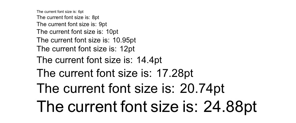
The second step is to make your font big enough. In the early days of the internet, font sizes were small. These font sizes get even smaller as the size of monitors gets even bigger. The size of the font used to be 12pt, but 16pt is a good standard for the web. It all, of course, depends on which font you choose.
The third step is choosing the right font. While font that looks like cursive and handwriting seem cool, they’re harsh on the eyes of your online visitors. The best fonts for your website come from the Serif font family. Times New Roman is the most well-known and used font from the Serif family. Sans Serif fonts can also work for your website.
Ensure Your Site Is Easy to Navigate
You may be tempted to break the mold in terms of your web design. Doing this can be good in some aspects, but not when you’re dealing with navigation. A site that has solid navigation will be ranked better in search engine results. More importantly, you don’t want to send potential clients on a wild goose chase while they’re trying to find out what you offer.
A few methods to ensure that your web design is easy to navigate include a few tricks. First, you want to ensure your homepage is linked to your logo. Your menu should be located at the top of your website. If your website is one that you have to scroll through then have navigation somewhere on the side. Lastly, you want to ensure that you have a strong footer that has other important links.
The Bottom Line
Web design is essential in making sure that your brand succeeds. While it’s easy to run away with your creativity, you want to make the best choices for your website. Above everything else, your website should attract new customers and entice them to try out your product or service.